

8 of the ugliest looking liveries on F1 cars this century
Some F1 liveries have been winners, others have not.
While we have seen many incredible F1 liveries this century, others – used for one race or a whole season – have not quite hit the mark.
Here’s a closer look at some of the liveries to have caught our eye for the wrong reasons over time.
Eight of the ugliest F1 liveries this century
Red Bull: May the force sponsor you (2005)

Formula 1 cars are, by their very nature, fast-moving adverts for every team’s various sponsors and partners, but Red Bull took the message a long way at the 2005 Monaco Grand Prix.
Flanked by Star Wars mastermind George Lucas, the RB1 was transformed into an all Star Wars livery to accompany the release of The Revenge of the Sith, complete with Darth Vader on the car and lots of flames, but what emerged was not the best-looking car we’ve ever seen.
However, you could also argue that it did its job of being memorable, because here we are, two decades later, still writing about it.
Speaking of movie promotions…
Jaguar: Diamonds are forever (sometimes) (2004)
Jaguar celebrated the arrival of Ocean’s Twelve into cinemas by racing with real – yes, real – $300,000 diamonds from Steinmetz implanted into the nosecones.
Not only did the team commit the sin of defying ‘red and green should never be seen’ for their colour scheme, a first-lap crash for Christian Klien saw the diamond in his car go missing, and not retrieved.
A backfire on a number of fronts for Jaguar.
Honda: Planet Earth (2007)
 Now, if you were already aware of this livery’s existence, you were expecting this at some point, right?
Well, we at PlanetF1.com Towers were actually somewhat divided on Honda’s 2007 challenger, which looked to raise awareness of global warming and the marque’s attempts at being more environmentally friendly.
However, we’ve opted to include this in our list as, quite frankly, it deserves to be there.
RB: Las Vegas by night (2024)

Racing Bulls, VCARB or just plain RB in 2024, Red Bull’s sister team channeled early-2000s Sauber in unveiling a glittery colour scheme for the Las Vegas Grand Prix.
The colour blend looked okay for the most part, but for the great big dollop of red on the Halo which threw it out of kilter.
A nice idea, not fully executed.
McLaren: Chrome (almost) (2023)

The 2023 British Grand Prix saw McLaren run a ‘throwback’ livery to their early-2000s ‘chrome’ look.
There is a saying, usually used in a comedic context but it also applies here, about a need to ‘commit to the bit’.
As Formula 1 fans as well as people who write about it, our advice to McLaren here would have been to either go full chrome, or leave it as it is. The blend of chrome and papaya didn’t quite work.
McLaren went with a greater chrome-to-papaya ratio in 2025, but we’d still like to see the full chrome coverage if they attempt it again in future. You know, for old times’ sake.
Ferrari: Blue or no blue? (2025)
Ferrari announced the team would be running a different colour scheme at the Miami Grand Prix, with Charles Leclerc and Lewis Hamilton decked out in blue and white race suits, harking back to the team’s North American Racing Team days.
Would an all blue-and-white car, marking their title sponsorship this season, emerge in Miami, however?
No.
What arrived was a crossover between the current livery with a bit too much blue and white for it to be unnoticeable. We’ll file this one under ‘missed opportunity.’
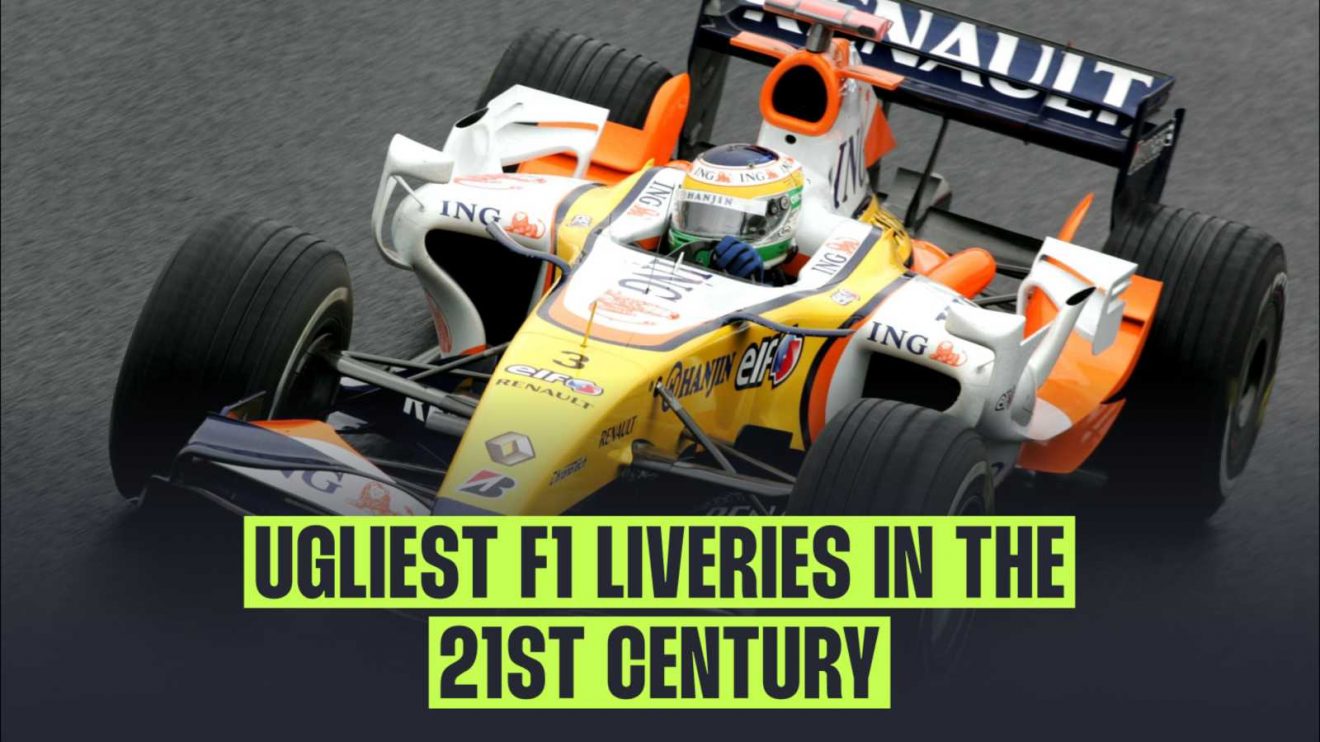
Renault: A mish-mash of colours (2007)

After achieving back-to-back titles with Fernando Alonso in its now-iconic blue and yellow colour scheme, a change of title sponsor for Renault brought about a change of livery colour scheme.
It’s hard to say how many times white, yellow, orange and blue have all appeared together on a Formula 1 car before, but Renault’s blend did not quite hit the mark in our opinion.
Caterham: The not-so-hidden front wing (2014)

The fullness of time means we can be honest: 2014 was not the greatest season for Formula 1 cars which were nice to look at.
This was mostly because every team was looking for different design solutions in the transition to the turbo hybrid era, and we saw multiple, erm, interesting front wing designs going in search of that goal.
While most of these designs were integrated into the liveries, Caterham took the novel approach of looking like it was trying to ‘hide’ its lengthy nose, by going from green to black as the nose went down.
Again, 2014 was not the ‘prettiest’ year across the grid, but Caterham’s two-toned livery tweak wasn’t the best.
Honourable mention: BAR’s ‘zip’ (1999)

While not quite the correct side of this century, we couldn’t have a piece about unsightly liveries and not include BAR’s two liveries in one, separated by a ‘zip’ through the middle of the car.
With one side in navy and the other in what would become the familiar white and red of the team, the car would appear completely different to viewers depending on which way it was turning.
Regularly listed among some of the more unsightly liveries in Formula 1 history, we couldn’t miss it out from here either.
Read next: Ranked: Each McLaren driver’s best F1 victory as new landmark reached