

Ranked: Every F1 2026 livery launched so far
We've taken a look at every F1 2026 livery so far, and ranked how they look.
After a swathe of launches in the past week, we’ve decided to take a closer look at the teams who have released their F1 2026 liveries to date, and picked our favourites.
There was lots of intrigue about not only how the cars would look, but how the liveries would look on real F1 2026 machinery – and for the seven teams to have launched so far, the reviews are good – generally, at least. Here’s our ranking of the teams’ looks so far:
1: Red Bull

The ongoing joke of how little Red Bull changes its look from year to year gets rightfully brought back each season, but to give the team credit this time, this year’s livery genuinely looks different to what came before it.
Gone is the long-held matte finish and navy colour scheme which made the liveries difficult to differentiate year on year, and instead comes a return to the glossy, lighter blue scheme with which the team barrelled its way into Formula 1 two decades ago now.
It has one happy viewer in particular in Max Verstappen, who said he has been looking for such a change for quite some time.
With new leadership, a new regulation set and new challenges to meet, why not nod to the past while also changing it up at the same time? It’s a big tick from us.
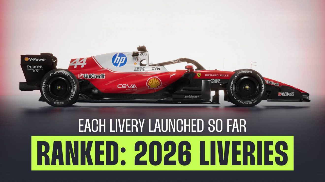
2: Ferrari

Speaking individually here, I’m surprised at how much the new Ferrari livery seems to have divided opinion among the tifosi and elsewhere.
The extra white around the top of the car looks striking, much like the iconic 312T2 from 1976 (coincidentally, 50 years ago this season), which powered the Scuderia to the Constructors’ Championship among a watershed season for Niki Lauda, whose famous title battle with James Hunt included his near-fatal crash at the Nurburgring.
In the present day, it’s a design that, along with a lighter shade of red and the additional contrast of swapping the front and rear wings to black, it nods to its past while still looking like a modern Ferrari.
Okay, there may be a dollop too much white, but the wing changes do not make it overwhelm the rest of the car. It’s a positive review from here.
3: Racing Bulls

A case of evolution rather than revolution with Racing Bulls’ livery this year, but the addition of the extra flourishes of blue, to mark Ford’s arrival at both Red Bull teams, creates a smart, clean livery that is instantly recognisable.
For those worried about having to double-take with another team on this list, the yellow Red Bull nose and extra blue should show the differences are clear enough to see.
A solid livery for one of the grid’s most dependable outfits.
F1 2026: Formula 1’s season of change
F1 2026 uncovered: Next-gen cars, new tyres, and design decisions
F1 2025 v F1 2026: Nine key questions ahead of huge regulation changes
4: Haas

Haas has heralded the arrival of its new title partnership with Toyota Gazoo Racing by making subtle but distinctly noticeable changes to its livery.
Lots of white and red, which appeared slightly Super Aguri-esque until the accents of black on the sides of the nose and in front of the cockpit make it more like a Haas.
The team has not been afraid to play around with its colour scheme over the years, though black, white and red have remained underlying features of most Haas liveries so far.
As for this one? It looks clean, the TGR branding blends in well with what came before it, solid flourishes elsewhere, but slightly plainer than some of the others.
5: Mercedes

The Mercedes W17 livery can probably be best described as a refinement of what came before it, using a slightly darker shade of silver and the silver-and green-front wing seamlessly blending into the rest of the car, which has retained its black held for several seasons now.
The blocked stripes on top of the sidepods appear a nod to the logo of Mercedes’ performance division, AMG, while new sponsors, tech giants Microsoft, appear prominently on the front wing and roll hoop.
A closer look shows the retention of the red three-pointed star, in honour of the late Niki Lauda, placed close to the cockpit this year.
It’s another solid effort from Mercedes, a more refined two-halved livery than Audi managed, though not quite as eye-catching as some of its rivals.
6: Audi

Potentially the most polarising look so far, perhaps because it is quite literally a livery of two halves.
It’s rare for a livery to utilise one colour scheme on the front and a completely different one towards the back, separated by a line – though Mercedes has walked this line quite well in recent times. For Audi, it’s certainly a brave look for a first Formula 1 car.
Shaky comparisons with the 1999 BAR spring to mind, though that was half-and-half down the middle (with a fetching ‘zip’), and that look eventually got banned.
The black and red looks great in and of itself, the silver also looks particularly solid in isolation (though Mercedes may have something to say about it in the years it goes silver), but the two together? It’s a big contrast.
We could say to leave us sitting on the fence, but we’ll find a completely different-looking car depending on which way we fall.
7: Alpine

A game of spot the difference on this one.
For the hype surrounding Alpine’s new livery, taking place on a cruise ship with one of its main sponsors, what was revealed was almost exactly the same – to the naked eye at least – as the early 2025 version of its livery. At minimum, the changes are subtle.
Probably the most disappointing livery of the lot so far in terms of excitement for the new era. However, it ultimately doesn’t really matter how the A526 looks, especially if it goes quickly. ‘A fast car is a beautiful car’, after all.
Have your say in our poll below!
Read next: Watch: Lewis Hamilton completes first Ferrari SF-26 laps at Fiorano shakedown


